Chris’ Corner: Monaspace
I’m a sucker for a new coding font. I generally don’t think what coding font you use affects productivity in any significant way (unless it’s distracting) so farting around and switching it up is just a fun little thing to do. Like pushing around the furniture in your room or taking a different bike route […]
I’m a sucker for a new coding font. I generally don’t think what coding font you use affects productivity in any significant way (unless it’s distracting) so farting around and switching it up is just a fun little thing to do. Like pushing around the furniture in your room or taking a different bike route to work.
So count me in for playing with GitHub’s new set of monospace coding fonts: Monaspace.

(Before I get too far without mentioning it, you can use them on CodePen just by visiting your editor settings and picking one.)
The fact that there is five different stylized versions alone is pretty note worthy, but there are a variety of other features that are pretty darn cool. Texture Healing feels like a made up term, but what it does is pretty easy to understand and clearly useful.

It basically makes it so wide letters don’t have to scrunch themselves and narrow letters don’t have to exaggerate themselves. They say:
Texture healing works by finding each pair of adjacent characters where one wants more space, and one has too much. Narrow characters are swapped for ones that cede some of their whitespace, and wider characters are swapped for ones that extend to the very edge of their box.
Which is done with the OpenType feature “contextual alternates”. It’s a little bit like a ligature, where certain character combinations flop out into a new glyph that works best with them together, only, ya know, slightly different.
Monaspace has ligatures too. Ligatures are pretty controversial in coding fonts. For instance some people really hate that != might turn into ≠ as a ligature as that is like a deviation from the literal syntax of the language you may be writing. They aren’t my favorite but it’s not a firmly held opinion and it’s easy enough just to not use them. (They aren’t enabled on CodePen, as it seems like it might be confusing for some beginners.)
They come as a variable font, which I love because variable fonts rule. And it’s not a phoned in variable font with one measly axis, it’s weight, and width, and slant, which is wonderful.

The download comes both with variable and non-variable versions. If you don’t plan to use the variable-ness, the variable fonts are an order of magnitude larger so probably use the non-variable versions. If it’s not on the web it probably doesn’t matter. Also curious they only shipped .woff and not .woff2?
My very favorite idea they have around this “superfamily” is the idea of mixing and matching them for different reasons in the same UI.
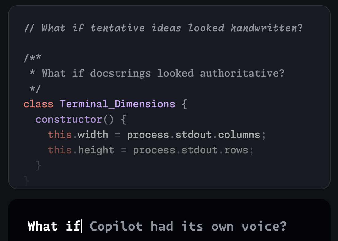
The idea of having an italic monospace is starting to be more and more common. Gotta shout out the OG Operator for breaking that ground. Setting comments in italics is still just a super cool idea to me. Now we could use Radon for that, a different typeface entirely designed for it. In the image above, they suggest JSDoc-style comments using Xenon and GitHub CoPilot using Krypton. I love it. Ship it. (But I don’t think it’s possible in VS Code yet, but considering Microsoft makes both, you’d think it’s coming.)
To make that possible, essentially, you need syntax highlighting tools to provide tokens/classes that make it easy to identify different aspects of code. It’s certainly possible, and probably not even that hard, but it’s probably a somewhat tricky thing to roll out with so many third-party themes out there.
But anyway, how great is this?

If you’re into playing with different coding fonts, well make sure to explore the fact that we have over 20 of them on CodePen to switch between. But of course there are far more than that out in the wild. A great read about the landscape of “playful and fun” coding fonts is Doug Wilson’s Coding with Character. Doug dug (ha) up this great example of IBM “SELECTRIC” TYPE SAMPLES (literally different typewriter fonts you could swap between by replacing a metal ball in the typewriter):

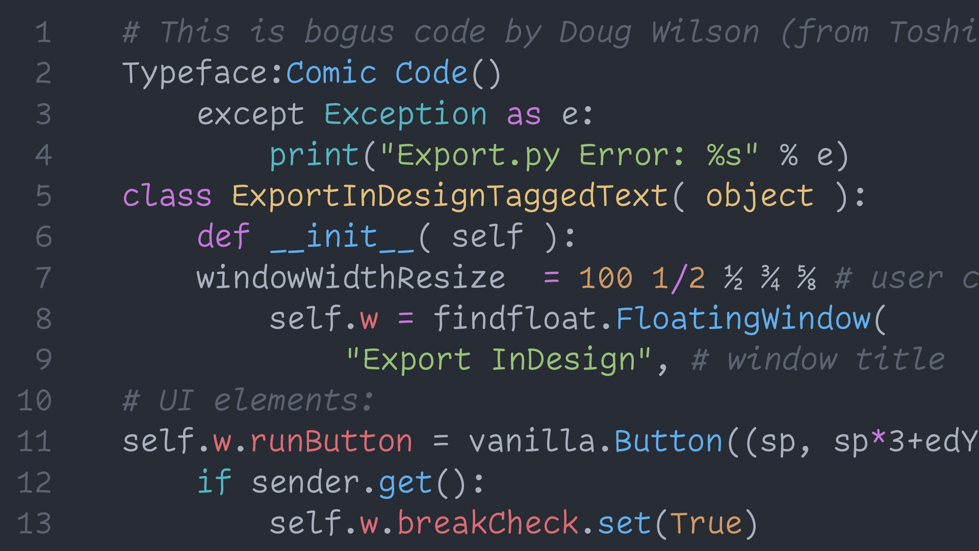
So cool! I love that this new wave of coding fonts is kind of a callback to what was happening here, whether everyone recognizes it or not. The first one Doug mentions is Operator which I used for years and years after it came out and still love. The second is Comic Code:
My first thought: This has to be a joke, right?! Comic Sans has a bad reputation and was never meant to be used for coding—but what if…? That is what crazy mastermind Toshi Omagari seemed to ask.
He says, “Comic Code is a monospaced adaptation of the most over-hated typeface.” I haven’t asked, but I feel his thought process may have been something like this GIF.
Believe it or not, I think it actually works and certainly brings a smile—or at least a smirk—to your face
Totally agree! It works!
While I was in our code base putting in the Monaspace fonts, of course I couldn’t resist doing general code cleanup. The Monaspace fonts only ship in .woff, so the @font-face in CSS is pretty much as simple as:
@font-face {
  font-family: 'Font Name';
  src: url('./fonts/font.woff') format('woff');
}
You can get away with only shipping in woff2 these days, so some of our fonts that have that format, that’s exactly what I’m doing. The simplicity there just feels great since this used to be such a complex bit of code in the past with loads of formats.
Then I recently learned from an Ollie Williams blog post that you don’t have to put the format as a string anymore, keywords work, so:
@font-face {
  font-family: 'Font Name';
  src: url('./fonts/font.woff2') format(woff2);
}
Gotta appreciate those little things
What's Your Reaction?


![Canva Tutorial For Beginners | How to Use Canva Like PRO [FREE] | Canva Full Course](https://img.youtube.com/vi/yWJp7gQqCQ8/maxresdefault.jpg)
