Chris’ Corner: Galleries, Grids, and GreenPrimaryDark6
Footer.design is a pretty fun gallery site, itself, of course, with a pretty weird/bold footer. I’ve designed my fair share of footers over the years and it’s certainly an area where you just wanna look at like 50 footers before you start in. See what other people are doing. Can you be clever? Should you […]
Footer.design is a pretty fun gallery site, itself, of course, with a pretty weird/bold footer. I’ve designed my fair share of footers over the years and it’s certainly an area where you just wanna look at like 50 footers before you start in. See what other people are doing. Can you be clever? Should you be clever? What kind of opportunities do you have down there?
I gotta admit I’m a bit torn, though. I love whimsey and weirdness and the footer seems like a fine place for that kind of action, the Ficitive Kin guide I linked to a few weeks ago douses some cold water on that.
The Nav and Footer are two places where best practices rule the day and innovation should be limited.
A visitor doesn’t want to be impressed by your unique navigation design. They want to understand what your company does and they want to get to where they are trying to go.
I do get that perspective too. I suppose it always comes down to what kind of site it is. Some designer’s portfolio website is a lot different than a website for a government agency.
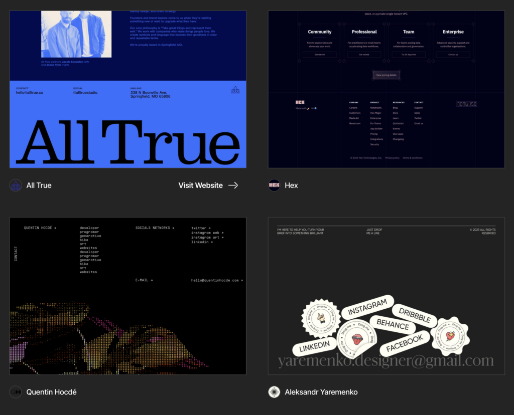
This past weeks’ CodePen Challenge that Marie put together was all about this sorta weird design trend people call Bento Box Design. Like so many design trends, it may have come from Apple who loves this sort of look for presenting dense information in an easily digestible way:

One of the resources she linked up is a design gallery site called bentogrids which has a ton of examples of the style.

I gotta admit I think the style is kind of charming and fun and I’m attracted to it. But I’m sure if I see it three more times I’m gonna be like ok moving on.
And speaking of niche and actually kinda strange design galleries, I find Pattern Club to be… that. It’s kinda like not really patterns, but also not not patterns. Anyway, I like it because it’s not the regular sort of design work I see.

OK well now I’m on a kick of sharing websites that are in the general vicinity of design galleries so I can’t stop now. Bramus Van Damme has been blogging about and following the idea of Scroll-Driven Animations for ages now, and I’m pleased to see he’s now built a website that bundles it all together. And with a cool domain name with dashes in it, which means I love it: scroll-driven-animations.style

I like that there are tons of demos, and they all feel rather practical. They aren’t hyper-specific landing pages or anything, they are more like patterns you could see yourself using one day. Although, of course, I love the extra fancy stuff too.
Are you ever like, you know what I need? A weird pseudo-rectangular blobbo mess. As SVG, please. That’s what this thing does.

Everybody loves a good fresh color palette, right? There are tons of sites for this. They wanna spit at you 5 colors and let your brain ooze with joy. Like Coolors, for example.

LOOK AT ALL THE PRETTY COLORS.
But can you actually make them work? What are you supposed to do with those 5 colors? I’ve always gotten a little lost there. I feel like what you really need is a set of neutral-ish colors that end up being most of your color options. Then a few colors for branding and pop. Probably a bunch of variations.
I dig the site Realtime Colors because of how it maps the colors you’re picking onto a fairly practical-looking website. Plus, then you can share the website with those colors chosen.

What's Your Reaction?


![Canva Tutorial For Beginners | How to Use Canva Like PRO [FREE] | Canva Full Course](https://img.youtube.com/vi/yWJp7gQqCQ8/maxresdefault.jpg)
